Exhibition design trends in the baby and child sector
If the words ‘baby and child products’ make you think of bright, primary colours and huge amounts of plastic, you might not be seeing the whole story. With more than 1,200 exhibitors from 50 countries and around 22,500 trade visitors, Kind & Jugend is the largest show in the baby and child sector, so it’s fair to say that it provides a good representation of current trends. As our design and build teams recover from their sterling work on the Vital Baby and Elvie stands at the show, we asked them to tell us what they saw.
Muted, block colours
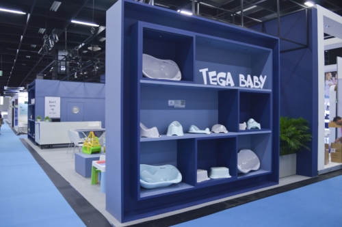
While there’s still plenty of rainbow brights around, many of the stands featured large expanses of plain colour in more subdued palettes to create a more restful feel. Whether it was the restricted palette of blues on the Tega Baby stand or the bolder Farrow & Ball-style colours at Inglesina, many stands used plain colour with light touch details to draw the eye without fuss.
Creative attractors
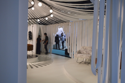
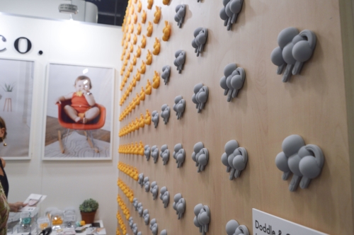
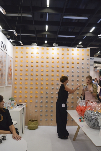
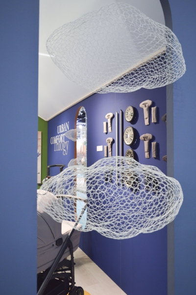
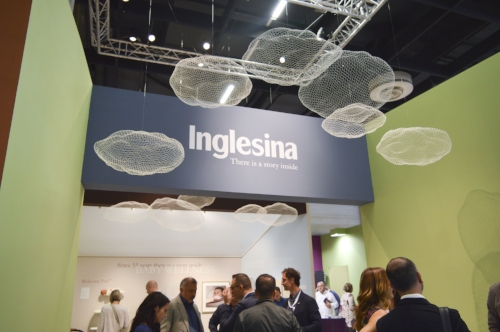
Against these plain backdrops, we saw some really creative ways of displaying products or engaging visitors: Doddle and Co’s tactile wall of rubber sunshines and clouds echoed their range of soothers, while Sleepyhead eschewed traditional stand walls in favour of layers of fabric at different lengths to create an inviting, softly-lit space. Another lovely detail was Inglesina’s wire clouds, that seemed almost to float without supports.
Pass on plastic
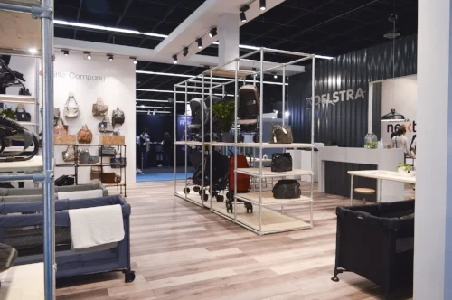
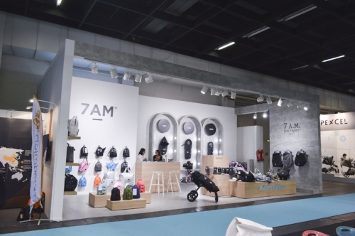
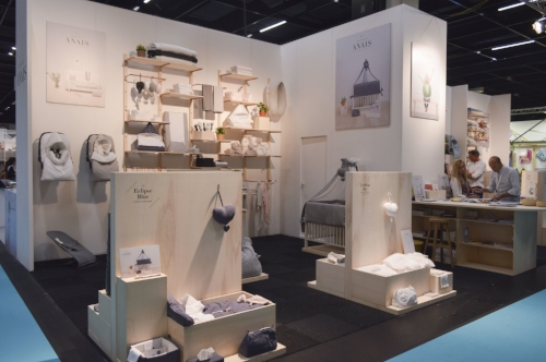
Many of the materials used were natural and/or industrial rather than plastic or vinyl. 7AM and Sparkle Group both used concrete laminate finishes to good effect while Koelstra’s industrial-style stand combined scaffolding poles with plain timber for a stripped-back look. Anais used minimal black text beautifully on their raw plywood plinths while Lassig’s open layout featured plants as well as timber for an informal but inviting space.
Attention to detail
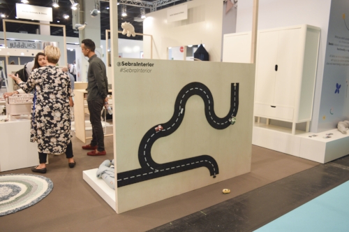
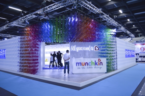
What made many of the stands work so well were the small details: open sightlines across the Baby Bjorn stand to draw visitors in, while Sebra Interiors employed really creative approaches to merchandising to create fun encounters throughout their stand. The Munchkin stand – always an eye-catcher – featured tantalising glimpses of the interior through the outside corners to create interest and excitement.
Stripped back – or not?
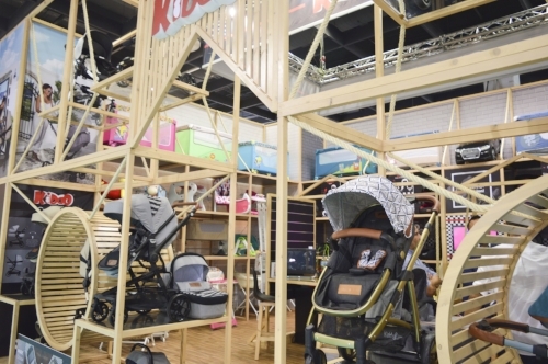
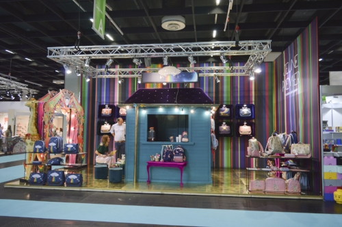
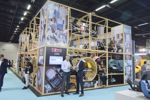
While many of the stands had gone for a more minimalist look than in previous years, other chose to stand out by heading in the opposite direction. Jeune Premier went for riotous colour and a circus theme, including vivid striped wallpaper and a pop-up book style entrance that made the whole experience playful and fun, while Kidoo used rope and timber to create a complex framework that housed products in unusual and interesting ways. Sometimes standing out means bucking the trends.
Once again, the Kind & Jugend show provided huge amounts of inspiration and ideas for future years and other shows, and highlights that the baby and child sector remains as vibrant and innovative as ever. If you're planning your event presence for 2019, we’d love to hear from you!